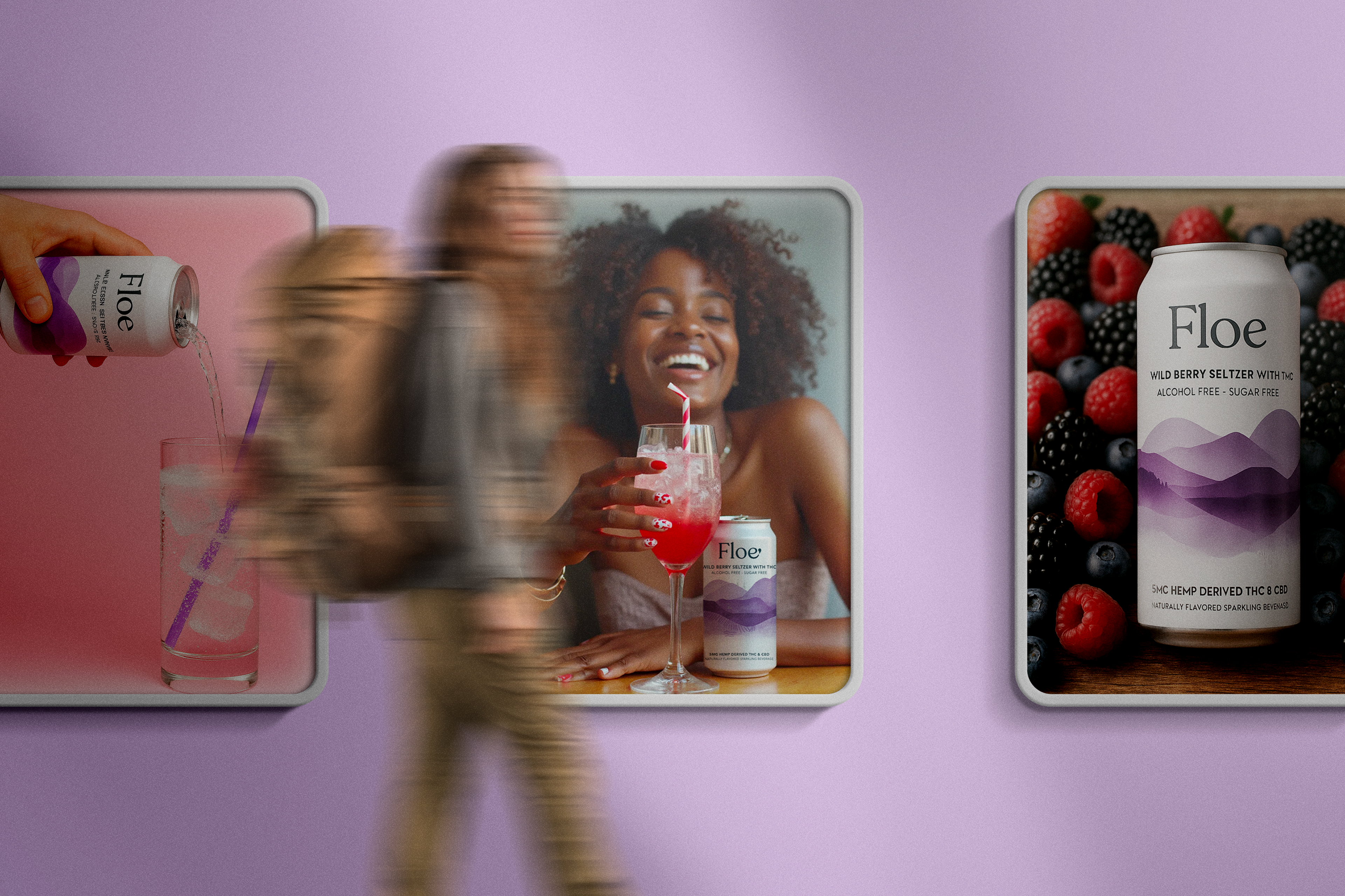
This project was completed in collaboration with the team at Stay In Your Lane Co., where I was contracted as a UX designer. The work showcased here reflects my contributions as part of the broader creative and strategy team.
We partnered with Floe to build a timeless brand and digital experience that feels confident, calm, and easy to shop.
We partnered with Floe to build their brand from the ground up. This included visual identity, packaging direction, UX design, and a custom WordPress site connected to Shopify. The goal was to create a timeless brand and digital experience that felt confident, calm, and easy to shop.
Floe’s blend of THC, CBD, and adaptogens called for a grounded design system that educates, reassures, and simplifies the experience for first-time users.
Floe’s unique blend of THC CBD and adaptogens required thoughtful design choices to educate and reassure first-time users. We focused on simplifying the experience through calm navigation transparent visuals and a grounded visual language that could carry the brand’s boldness without overwhelming the user.


Floe’s visual identity was designed to balance wellness and sophistication through intentional color, typography, and a system built to scale.
We crafted Floe’s visual identity to balance wellness and sophistication without leaning into cliché. The color palette mixes soft greens and muted blues with subtle brights to create a sense of clarity and energy. Avenir Next brings modern structure while Georgia Italic adds warmth and personality. The final system is minimal but expressive built to scale across packaging digital and print.
In a trend-driven category, Floe’s brand was designed to feel grounded, calm, and enduring while maintaining approachability.
The nonalcoholic beverage space is crowded with brands chasing trends like playful gradients pastel tones and Gen Z–targeted language. While competitors leaned into bright colors and novelty Floe took a more grounded approach focused on clarity calm and long term connection. Our goal was to build a system that felt elevated and enduring without losing approachability.
The website layout was designed for simplicity, scalability, and seamless integration with WordPress and Shopify.
The layout was built with simplicity and scalability in mind. Every section was designed to be achievable in WordPress using flexible content blocks while allowing for seamless Shopify Buy Button integration. This structure gave the client a balance of creative control and ecommerce functionality without needing a custom build.
The site design combines softness and structure to create a welcoming, educational, and emotionally resonant user experience.
The site design blends soft textures natural illustrations and expressive photography to reflect Floe’s product benefits and brand personality. Clear hierarchy intuitive flows and calming visuals guide users through the experience while emphasizing product education and emotional connection. Every screen was built to feel welcoming grounded and easy to navigate.
Shopify’s Buy Button was integrated to enable lightweight e-commerce while preserving full control over design and content.
To keep the experience lightweight and flexible we used Shopify’s Buy Button to integrate e-commerce directly into the WordPress site. This approach gave Floe a clean way to manage sales and inventory without needing a full Shopify build while maintaining complete control over the site’s design and content.
A subtle micro-interaction was designed to reveal Floe’s functional ingredients in a calm, intuitive, and educational way.
We designed a subtle micro-interaction that invites users to hover or tap to reveal each of Floe’s functional ingredients. The interaction adds a moment of delight while supporting education and transparency. It gives users a calm intuitive way to explore what’s inside each can without overwhelming the page with static information.


Floe shows that wellness branding can lead with clarity, trust, and longevity through thoughtful design and strategy.
Floe proves that wellness branding can feel calm, confident, and clear through intentional design and meaningful user experience. By prioritizing usability, education, and emotional connection, we built a flexible brand system and digital experience designed to grow with the company. From strategy to launch, every design decision supported long-term clarity, trust, and simplicity.
Explore more work that blends strategy systems and storytelling.