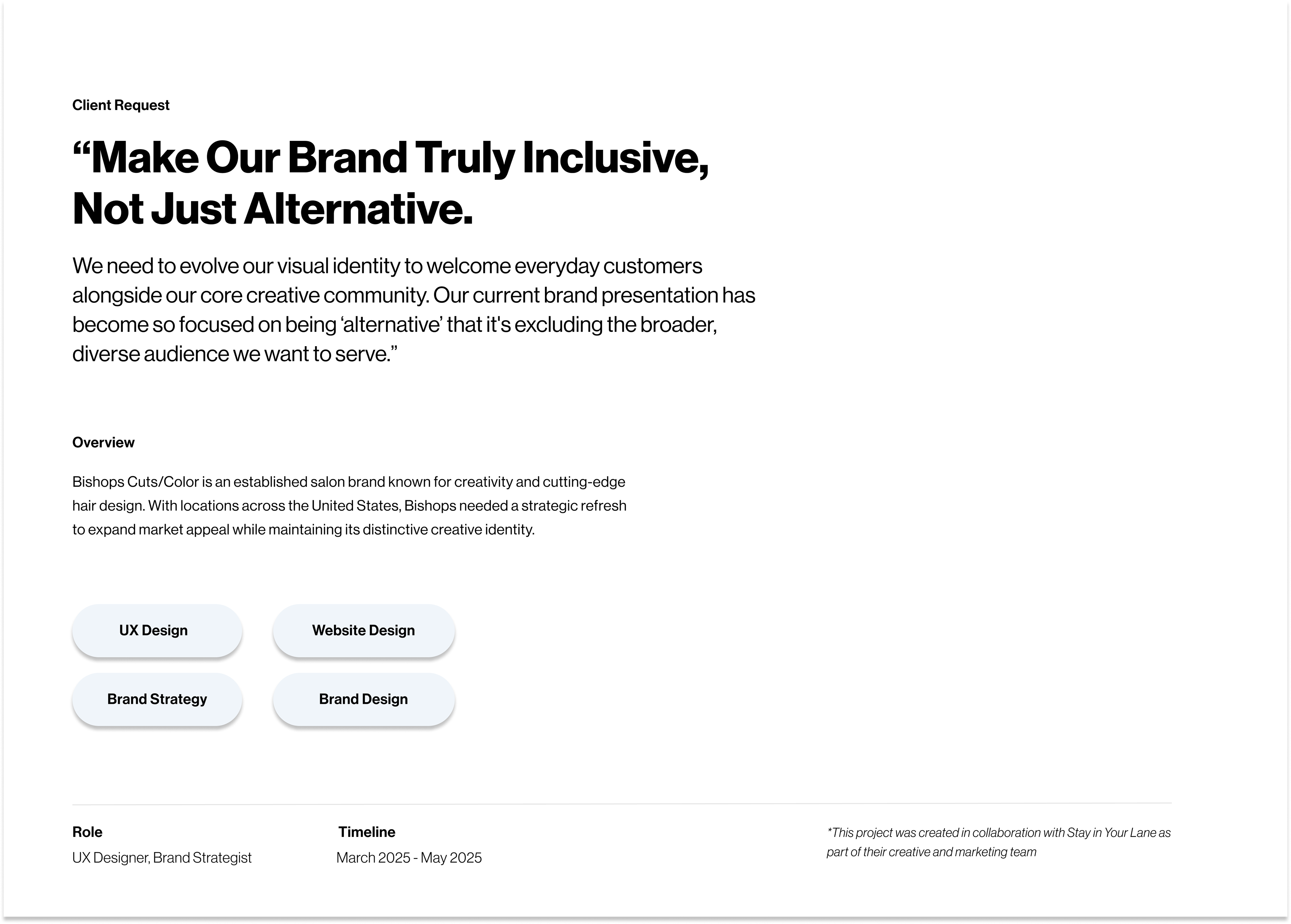
This project was completed in collaboration with the team at Stay In Your Lane Co., where I was contracted as a UX designer. The work showcased here reflects my contributions as part of the broader creative and strategy team.
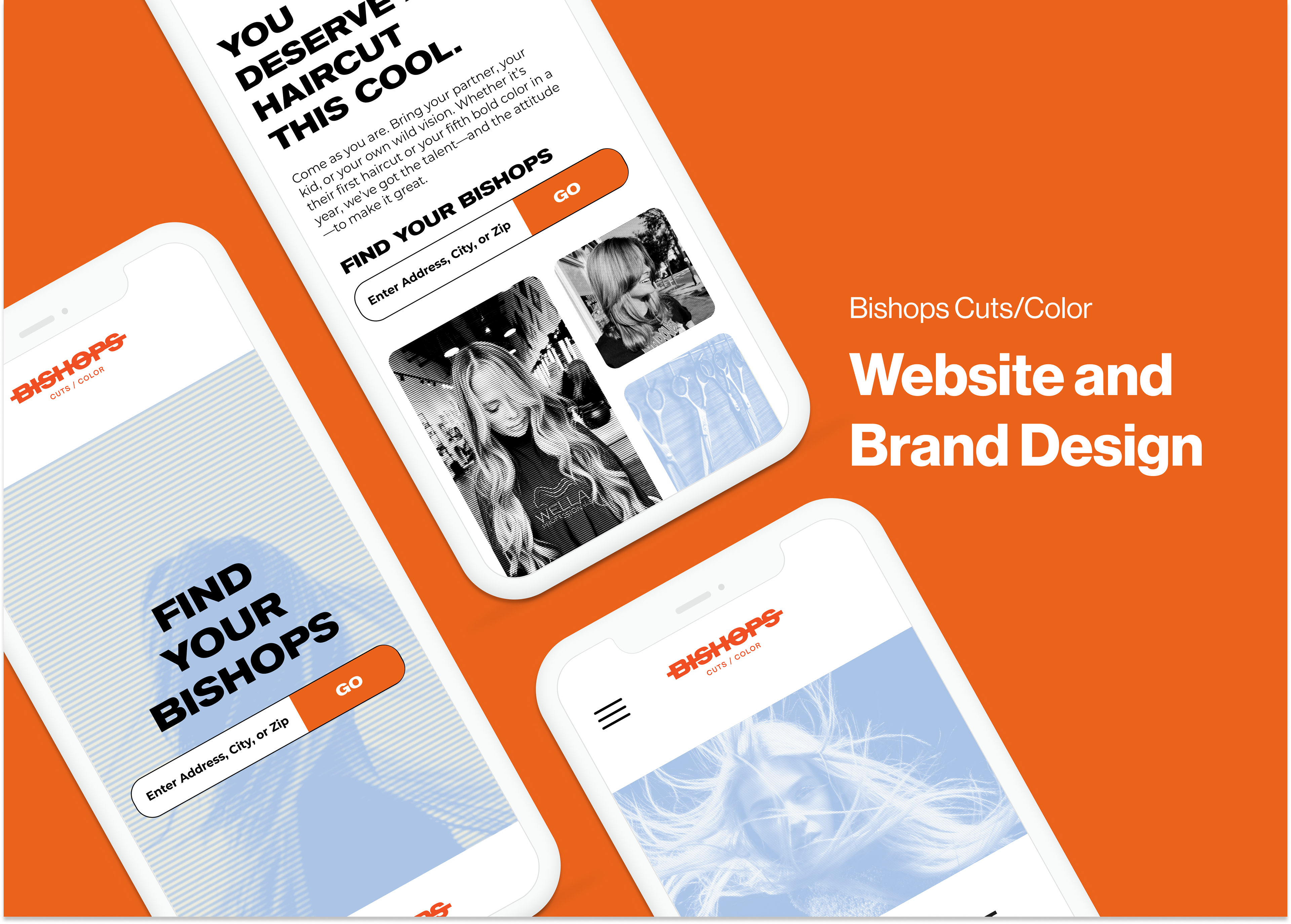
The project established a refreshed identity and website built for inclusivity, clarity, and conversion
Bishops Cuts/Color partnered with Stay In Your Lane Co to evolve its bold, edgy identity so that it remained true to its creative roots while becoming more accessible to everyday consumers. This refurbishment of brand elements was carried into a redesigned website focused on simplifying booking, strengthening messaging, and supporting franchise growth through a dedicated landing page.
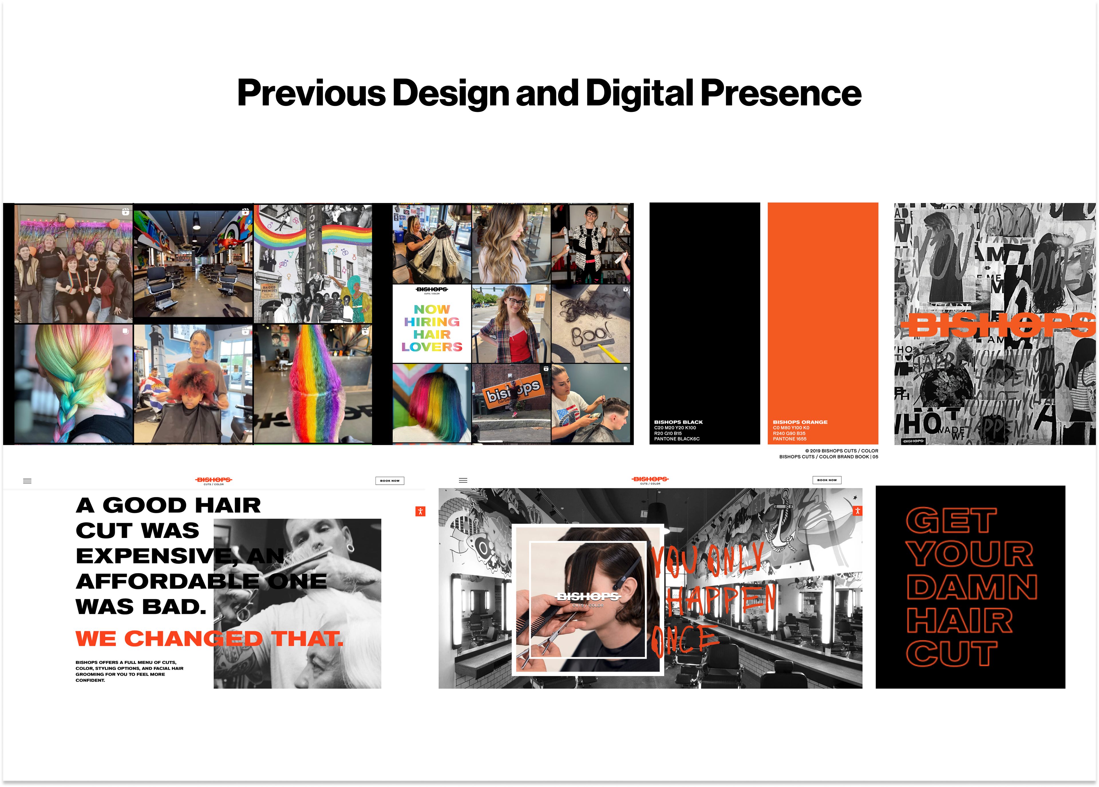
The challenge was balancing the brand’s distinct personality with wider appeal
Previous brand styling leaned heavily into dark, grungy aesthetics and subcultural visuals that resonated strongly with niche audiences but felt less inviting to customers seeking a quality haircut without the edge. Navigation, content structure, and tone were misaligned with the needs of more mainstream users, which limited growth potential.

The team guided the brand refresh, identity rules, and digital design process.
In collaboration with marketing and graphic design partners, the brand refresh introduced complementary colors, a new typeface for body text, while retaining key display typography, and updated layout guidelines for scalability. The team also established image treatments, conducted accessibility color audits, prepared brand guidelines and type hierarchy rules, and then translated all of that into wireframes, prototypes, and a detailed handoff for the consumer website redesign.


The design focused on clarity, accessibility, and maintaining brand edge.
A moodboard process explored softer, inclusive tones such as muted blues and creamy stone shades to balance the brand’s bold presence. Typography pairing was refined for readability across devices with strong hierarchy. Whenever color combinations or layouts were used the refresh adhered to accessible contrast standards. Visuals were modernized yet retained an artistic edge with stylized photography and treatments that echo the heritage look.


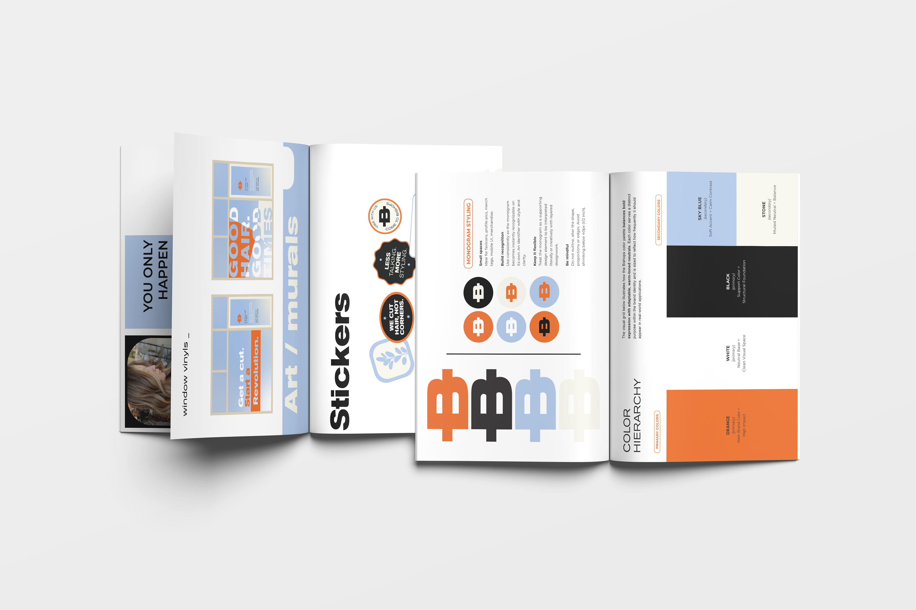
Brand Guidelines for Franchise Consistency
Our graphic designer developed an extensive brand guide covering everything from logo usage and color hierarchy to photography murals and even sticker design. This document served as a foundational tool for both internal teams and franchisees ensuring the Bishops brand could scale with consistency clarity and creative integrity.
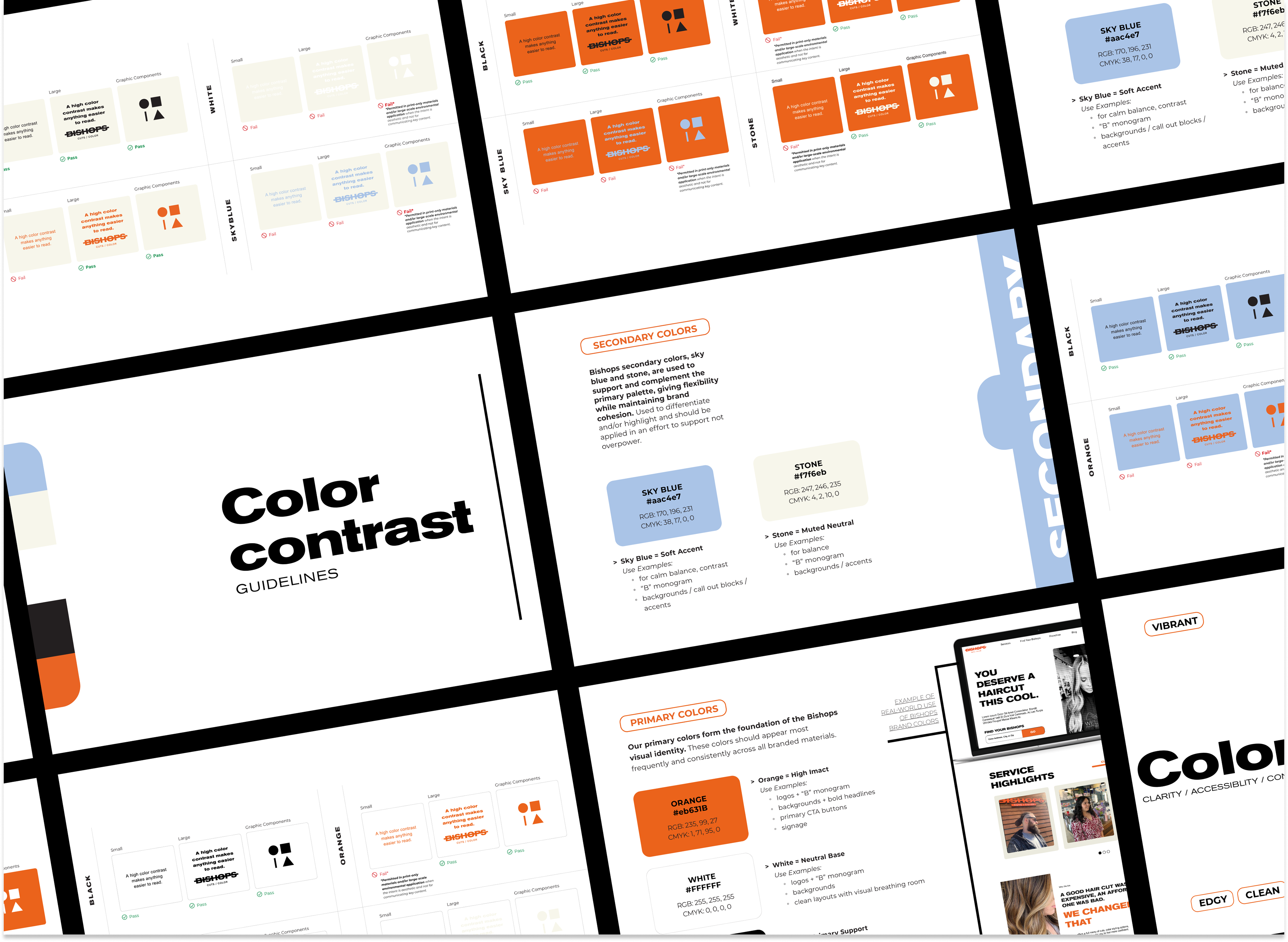
Accessible color standards were applied to support usability and ensure consistency across a scalable design system.
We created a detailed accessibility guide to help the Bishops team and franchisees apply colors in a way that meets contrast standards. The guide outlined how each color should be used across backgrounds and text combinations to ensure readability and inclusivity. These standards directly informed the UI design of the updated consumer website helping create a visually consistent and user-friendly experience.

The refreshed brand was applied to the consumer website to create a cohesive and modern user experience.
With the updated brand identity in place, we translated it into a redesigned consumer website. We applied the full-color system, typography, and image treatments while ensuring every color pairing met accessibility standards. The result was a site that felt cohesive inclusive and aligned with the new direction without sacrificing the Bishops edge.

Strategic messaging was developed to support organic growth and strengthen brand positioning across touchpoints.
In partnership with the marketing teams at Bishops Cuts/Color and Stay In Your Lane we crafted strategic CTAs and SEO-optimized keyphrases to drive organic lead generation. Every heading section label and action button was intentionally worded to improve search visibility and guide users toward booking appointments making sure the design served both form and function.

The franchise page was designed to drive lead conversion through clear content, strategic CTAs, and seamless form integration.
We designed a dedicated Bishops Franchise landing page within the main site to support franchise growth and visibility. The page highlighted Bishops’ unique value proposition for franchisees and was integrated with HubSpot for seamless lead capture and management. It was designed to communicate opportunity while aligning visually with the refreshed brand system.
The result delivered stronger brand consistency, improved customer usability, and a clear path for franchise inquiries.
Consumers now encounter a brand appearance that feels both charismatic and approachable; booking flows and service discovery are more intuitive. Internal teams have a scalable style guide that supports both consumer and franchise materials with consistency. The franchise landing page was designed to support lead capture via HubSpot integration, improving visibility for expansion efforts and creating a smoother path from interest to inquiry.
See how I bring brand systems to life across digital experiences